Illustration Friday - "Polar"


Say what? "Benedicamina Illumination" is the title of this pen and ink (and gold leaf) painting/drawing. "Benedicamina" because that's written on the scroll held by the angel at the top, which is loosely translated from Psalms 103 as Bless God Always. I had to find verse that might have been used in ancient times and would fit in that little space. "Illumination" because I drew it in the form of an ancient illuminated manuscript.
I LOVE illustrated manuscript art, the more complex and colorful and full of line-work, the better. A Book of Hours is a treasure I could spend days or weeks studying, but I doubt I'll never be allowed to peruse an authentic one, though occasionally someone will sell a single page on eBay. I've also seen them exhibited at the Getty Art Center here in Los Angeles. Then there's the Book of Kells ornately decorated by monks in Dublin, Ireland, famous for its extraordinary beauty and detail.
For two or three years, I've wanted to try making one myself. I didn't feel capable of actually writing a page from a manuscript and illuminating (decorating) it, so I just went with the decoration part, and just wrote a one-liner from Psalms 103. It took six full days! I tried to be authentic as far as using colors that existed at the time and gold leaf, but I couldn't see using real vellum (from calf skin) for so many reasons.

I've got pieces of April
I keep them in a memory bouquet
- Best of Three Dog Night I've got pieces of prints in a memory collage. Recently I decided to make handmade paper to print on. My printmaking professor (I'm calling him "Professor" in exchange for a good grade) had saved up lots of prints gone bad, which he had torn into tiny pieces, ready for papermaking. He let me take what I needed for my project. Some of the little printed pieces looked like little prints in themselves. So I culled some out and made this collage from them. I'm taking it to class tomorow to see if anyone recognizes any of the pieces.

And above is a woodcut I printed on beautiful Italian paper. There's so much groovy paper out there; it's hard to simply make a plain old black and white print.
Coming up next: a groovy black and white print or two.

I guess artist Egon Schiele was a crazy guy and a lot of his nudes are too, ummm, confrontational for me (Mom, don't look him up on the Net!). But some of his drawings were brilliant and even emotionally moving, appearing to show bruises or blood vessels, visceral skin marks that shout vulnerability and pain. This woodcut print was inspired by his drawing "Reclining Woman With Green Stockings" from 1917, the year before he died at age 28, three days after his wife died, both from Spanish flu.

I bought the most interesting handmade paper from Phoenix Art Supply (.com)* in vivid red with small pieces of printed text in it! I used it for the linocut above --you can see one of the clippings near her right temple. By operator error, the rest of the clippings were covered up by the black ink. Oops. Anyway, when a piece of paper is used on top of the support page, it's called Chine-Colle, pronounced shin collay, meaning paper and glue, basically.
Above is another linocut using Phoenix's handmade paper with a blue and aqua pattern. Again, I'm not showing the paper off well, but it really is pretty. I'm actually listing a print from the Weathervane series for sale, believe it or not, on ebay for charity - the Arthritis National Research Foundation.
*I have no connection to Phoenix Art Supply (http://www.phoenixartsupply.com) except I have bought lots of lovely (and crazy) handmade paper from them online. They have unusually helpful and friendly customer service by Judy L., who even sent me a Thank You note after my first purchase. And I didn't spend that much; she's just sincere about her job.


 This is a collage on a postcard for my friend Nicole. I tried to use images that relate to her. I've included images of a koi, the beach, boats, sailing, girls, a bird, dog, visit to Texas, cows and the word "breathtaking". As I look at the collage, I must say how much it does remind me of her. Except perhaps for the orange koi fish (that's rising head-first out of the island in the background): that doesn't really relate to her in any way I can think of. Wait ....No.
Also the dog and bird in the foreground -- she's never had a dog or pet bird. A guinea pig, a little blue fish, but no dog or bird. I thought they were cute. I couldn't find a picture of an iguana.
Neither of the girls in the collage remind me of her, actually. As for the beach/boat/sail image theme, she does live near a beach, and while she neither goes there nor sails, I happen to know that she knows someone who sells boats. So the collage works well with regard to the pet/girl/beach/boat aspects. Or the beach/boat aspects.
Nicole is definitely "breathtaking". End of story. The first (and only) time she was in Texas was to visit me! She was gestating in the womb at the time, but that's no reason not to count it. While in Texas, we saw lots of cows, just like the ones in the collage. That's a gimme.
So all in all, I think it truly captures the essens d' Nicole, and it's probably the finest collage I've ever made, to boot. In fact, I'm quite sure I never finished the other one.
Nicole, I love you, girl!!! I'm putting the card in today's mail.


About the first image, the pink rose: We grow these curly, almost neon-pink-and-orange rose bushes in our back yard which no one can see but us, and I'd bet Joe's not looking much, so that leaves me and the cat. But I really do like them. The black dots came from the filter. The image below it is a Japanese Plum tree twig from the tree in our yard.

This is one of those California ice plant flowers that open at sunrise and close at sunset. This one was just about to open up. I say "California ice plant" because my husband never heard of ice plants until he moved to California. It grows all over the neighborhoods where I grew up, near the south bay beaches, especially around the Playa del Rey dunes. I vividly remember seeing ice plant on my walks to school and the beach as a kid, and outside my old Playa del Rey condo.


I adore paper and have ever since I was a kid browsing stationery stores with my mom. So it just naturally follows that I'd go overboard when ordering pretty decorative papers for printmaking, for my Chine-collé prints. I already had several sheets of handmade paper, but not the thin, almost tissue-like paper preferred in Chine-collé printmaking (from the French meaning, loosely, "paper with glue").
.
(Above is a 6"x9" drypoint chine-colle engraving of the Arles River,
printed on BFK Rives printmaking paper)
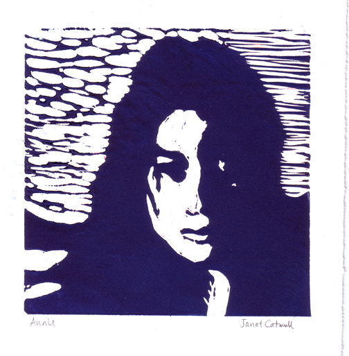
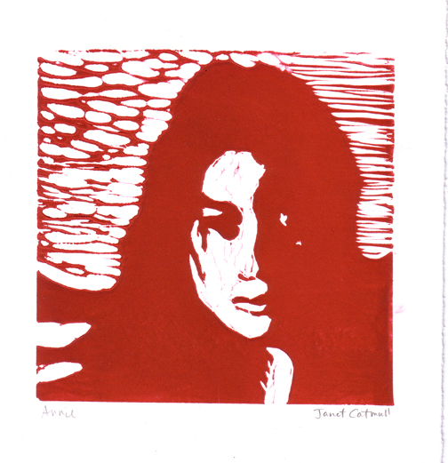 I hope there's not such a thing as "too much Annie", because I made several of these linocut prints (linoleum carvings), in blue, red, purple, and in between. They're about 7" square plus the paper margins. (Guess what her siblings are getting for Christmas? Nah...)
 This is a good time to bring up something that's been bugging me. I feel silly every time I type "pen and ink." I'd like to know who came up with that term. Pen and ink. Am I missing something? If you use a pen, doesn't it follow that you also use ink?
Anyway...I wish there was a career for doodlers. This is a pen and ink (don't want to confuse you) doodle I did a couple years ago. It's very small (surprise!), only 4x6", but I'd like to keep going until I have a section that I can turn into Christmas wrapping paper, if that can be done at a reasonable cost. I like how it undulates, but I get motion-sick if I look at it that way too long.
 I've always wondered whether there is a difference between purple and violet. I finally looked into it, and not just by checking my box of crayons. Purple is a group of colors that includes violet, violet is more red, and purple is more blue. That's just generally speaking. I know you want all the amazing details you can get your hands on, so here's the Wikipedia page on the subject.
This image is a monotype of the Titanic. It looks different than my others because I used a buff-yellow printmaking paper instead of white, and a layer of white ink under the dark ink. And I admit, to go with the "purple" theme, I added just a hint of violet color (using Photoshop).
Sometimes I prefer my "quick-draws" to the drawings I spend a lot of time on, because I don't get caught up in unnecessary details. I stopped working on this after about 45 minutes, deciding it was okay as it was. A highly detailed version might have taken three or more hours.
 John Lovett's Farm -- watercolor
 Roman Harbor -- a monotype painted from the positive. A monotype starts with a zinc plate, on which I rolled white oil-based ink, then painted the image using black etching ink and a very stiff, short paintbrush.
 Dressy Biker -- a linocut, which is a print made from a sheet of linoleum which I carved and inked. Can you tell she's looking down and her face is hidden? (My husband said her blouse neckline looks like a man's beard!) I'll keep working on it.


