Tuesday, March 06, 2007

Statue of Mary Drypoint with Chine-Colle


Thank you to my sister-in-law Kathy, an excellent photographer) for allowing me to use her photograph of a lovely statue of Mary, from which I made this drypoint etching with chine-colle paper (the blue, tissue-like background). The image is about 4x6".

Crow monotype


A friend and I made some paper the other day. The most I can say is: I learned a lot. Next time I'll use less colored paper, blend it finer, bring plenty of towels, and use a finer screen. And since the paper has a busy pattern, I am limited to a solid print so the pattern doesn't fight the print for attention. This is a monotype of a crow, a positive monotype (meaning I brushed the oil-based ink onto the plate rather than removing the ink from a fully-coated plate).
I'll be matting it, given the rough...deckle.
Not sure I'm a fan of the paper, but I'm willing to try again and hope for something a bit more refined. If anyone has any pointers, I'm all ears.

Chine-collé drypoint engraving

I adore paper and have ever since I was a kid browsing stationery stores with my mom. So it just naturally follows that I'd go overboard when ordering pretty decorative papers for printmaking, for my Chine-collé prints. I already had several sheets of handmade paper, but not the thin, almost tissue-like paper preferred in Chine-collé printmaking (from the French meaning, loosely, "paper with glue").
.


(Above is a 6"x9" drypoint chine-colle engraving of the Arles River,

printed on BFK Rives printmaking paper)


"Chine-collé" prints add a layer of color to what would usually be a black and white print. It might also add a texture and/or pattern; here the paper has stringy inclusions like the white streak seen in the foreground above the windows and the uneven sky. The paper is a blended two-tone, from yellow down to brown.

Here's the how-to: Brush glue all over one side of your Chine-collé paper, ink your engraved plate, and place it face up on the press bed. Place the Chine-collé paper on the inked plate, glue side up, then place the heavier printmaking paper on top of that, and print. When you pull the print, the tissue paper will have adhered to the printmaking paper, and the inked image will appear on the tissue paper! Got it?

Thanks to BDP for the photograph on which this print is based, and looking forward to "borrowing" photographs from Rome!

Saturday, January 20, 2007

Thursday, November 16, 2006

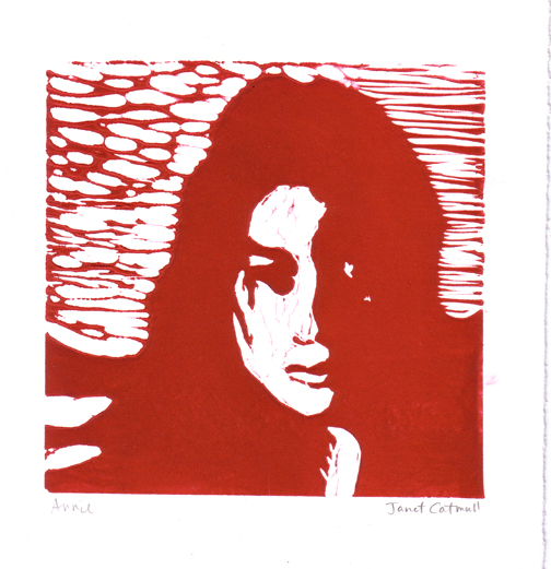
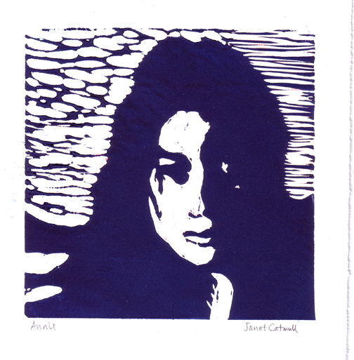
Too Much Annie? - Linocut on BFK Rives paper

I hope there's not such a thing as "too much Annie", because I made several of these linocut prints (linoleum carvings), in blue, red, purple, and in between. They're about 7" square plus the paper margins. (Guess what her siblings are getting for Christmas? Nah...)

Friday, November 10, 2006

PEN ... and ink

This is a good time to bring up something that's been bugging me. I feel silly every time I type "pen and ink." I'd like to know who came up with that term. Pen and ink. Am I missing something? If you use a pen, doesn't it follow that you also use ink?

Anyway...I wish there was a career for doodlers. This is a pen and ink (don't want to confuse you) doodle I did a couple years ago. It's very small (surprise!), only 4x6", but I'd like to keep going until I have a section that I can turn into Christmas wrapping paper, if that can be done at a reasonable cost. I like how it undulates, but I get motion-sick if I look at it that way too long.

Tuesday, November 07, 2006

The Titanic (monotype): or what's the difference between purple and violet?

I've always wondered whether there is a difference between purple and violet. I finally looked into it, and not just by checking my box of crayons. Purple is a group of colors that includes violet, violet is more red, and purple is more blue. That's just generally speaking. I know you want all the amazing details you can get your hands on, so here's the Wikipedia page on the subject.

This image is a monotype of the Titanic. It looks different than my others because I used a buff-yellow printmaking paper instead of white, and a layer of white ink under the dark ink. And I admit, to go with the "purple" theme, I added just a hint of violet color (using Photoshop).

Sometimes I prefer my "quick-draws" to the drawings I spend a lot of time on, because I don't get caught up in unnecessary details. I stopped working on this after about 45 minutes, deciding it was okay as it was. A highly detailed version might have taken three or more hours.

Thursday, September 28, 2006

Watercolor, Monotype, and Linocut --Been Busy

John Lovett's Farm -- watercolor


Roman Harbor -- a monotype painted from the positive. A monotype starts with a zinc plate, on which I rolled white oil-based ink, then painted the image using black etching ink and a very stiff, short paintbrush.

Dressy Biker -- a linocut, which is a print made from a sheet of linoleum which I carved and inked. Can you tell she's looking down and her face is hidden? (My husband said her blouse neckline looks like a man's beard!) I'll keep working on it.

Sunday, September 17, 2006

Brenseph aka Joeden


This is freaky. I started out painting two-year-old nephew Brendan (quite adorably wearing his hiking gear), but by the time I was finished, he looked like a mini-Joe (my husband). How could that happen?

Thursday, September 14, 2006

Ape - linocut


Dad's always been a Tarzan fan, which is why I like apes and the old Ape Man himself (Tarzan, not Dad). Here's a linocut printed on Rives BFK, 3" x 3".

I was inspired by Andy Warhol's screenprint which is mostly purple, yellow, and brown, 3' x 3', and much better executed than this poor wide-eyed guy. But the charm sometimes lies in the flaws, in my opinion.

Wednesday, September 06, 2006

Drawing of Annie in Elevator


This is a drawing of Annie in her elevator at work, photograph courtesy of Todd.

9"x9" Conte pastel pencil on pastel paper

Monday, September 04, 2006

Judith


A pen and ink drawing (Micron pen) about 5" x 3" ...
after Klimt.

Illustration Friday - "SAFE"


This is my post for Illustration Friday. The topic is "safe," so I've chosen to paint a man's hide-away-wallet where he hopes to keep his cash safe. Not terribly original, but I'm trying!

Wednesday, August 30, 2006

EDM Challenge #82 - Draw Your Art Work Space

This week's Every Day Matters challenge is to draw or paint your space where you do your artwork. I drew mine with ink and markers. It's a bit cartoon-ish, but that's the mood I was in! My space is bright yellows, purples, greens, pinks (especially) and all those beautiful colors we're supposed to have outgrown, so I enjoy them in my own room!


Monday, August 28, 2006

EDM Challenge #81 - Draw a Streetlight

For my Every Day Matters group, we are challenged to draw or paint a streetlight this week, Challenge #81. Mine is a pelican sitting on a lamppost on the Santa Barbara Pier. I took the photograph about two years ago, and painted it as soon as I got home, using soft pastels.

Saturday, August 26, 2006

EDM Challenge #80 - Draw Something You Love


This is Challenge #80 for my Every Day Matters Group, the subject is "Draw Something You Love," and I immediately thought of my cat, Andy. This is a drawing of Andy asleep on the couch, being drawn by me.

Here's the one of the sites for Every Day Matters: http://www.dannygregory.com.

Thursday, August 17, 2006

You Are What You Search

This is definitely off topic, but AOL apparently released to the public what search terms its users entered, and there's a funny article on the subject. (One search term was, "i hurt when i think too much i love roadtrips i hate my weight i fear being alone for the rest of my life".)

Here's the URL: http://www.slate.com/id/2147590/?nav=tap3


And while I'm here, I'll post a pen and ink drawing of the old casino at Avalon, on Catalina Island. It's still in my sketchbook, as you can see. I kinda like that frame. If you click on it, you'll get a larger version.

Thursday, August 10, 2006

Three Monotypes and Class Ends...

Here's a monotype of an eccentric artist, Egon Schiele, a crazy dude. He lived only 28 years, dying from the flu epidemic in the early 1900's. The image part is 6x9".

Next is a drypoint etching of Joe's mother on the porch of Yellowstone's Lake Lodge. This was done by scratching an image into a clear plexiglass plate, spreading ink into the scratches, wiping the surface off, and printing it onto damp paper. (same size)


Finally, a drypoint etching of a fishing boat in Marina del Rey called the Mona Lisa. This one's larger, about 14" tall.

Today was the last day of this Printmaking class, but I'm taking a course that's basically the same, which starts in just 3 weeks! yay!


That was a really challenging, stimulating, satisfying class.
Can't wait to do it again. On the final day of class, we exchanged prints, so I got one print from every student in the class, and they got one from me. I'll post it later; ta ta for now.