Monday, March 23, 2009

Mourning the End of Battlestar Galactica


I'm a new but rabid fan of "Battlestar Galactica," a Sci-Fi channel tv series which aired its finale on Friday night. This morning I'm holding my own private wake by slipping Disk One Season One into my DVD player, and watching Episode One (so far...). I paused the player as Gaius Baltar and Six were kissing (one of thousands maybe?), inspiring a sketch in my sketchbook.

Tuesday, December 23, 2008

I'm Dreaming of a White Christmas in L.A.

My Christmas Mandala, drawn a couple years ago.

Yes-- I am dreaming of a white Christmas here in Los Angeles. Why not? I've already let three plants die by failing to cover them in time for overnight freezes this week. So... Freezing temperatures + a little moisture = snow. (I got an A in meteorology.) I definitely like to dream.

Joe and I are going to my side of the family's home this year and I'm very excited to spend time with my parents and most of my five brothers and their families. Merry Christmas and Happy New Year to you and yours!


Janet

Tuesday, November 25, 2008

Drawing of Emma, early morning on lake porch


Emma on Lake Lodge porch
Originally uploaded by flickring
Another drawing of Emma, apparently my little muse!

Charcoal, graphite, and soft pastel on toned pastel paper
12" x 9"

Emma

Emma strikes the loveliest poses without awareness or self-consciousness, and has a fascinating face. This is drawn mostly in the sfumato style -- hazy, with few hard edges.

Graphite, 12" x 9"

Friday, November 21, 2008

Wire Man


In my life drawing class, our teacher assigned this as homework to us: create a wire figure of a drawing we did in class. "Wire Man" is about 16" tall.


I've posted two close-ups below. By the way, if you try this, I recommend using soft wire, or even floral wire, because very firm, stiff wire is so difficult to work with that half way through you just might give up!


Speaking of life drawing class, I've got to go get ready for it! Happy Friday and weekend!

Wire Man


Wire Man full
Originally uploaded by flickring
"Wire Man"
In my life drawing class, our teacher assigned this as homework to us: create a wire figure of a drawing we did in class. "Wire Man" is about 16" tall.

Monday, October 27, 2008

Paint pots

One event at the Old Town Newhall Street Fair a few weeks ago allowed kids to paint posters. I snapped a photo of the paint pots, using my crummy phone camera. Sometimes it takes more interesting pictures than my good camera.

A recent trend I've seen is to use the cheapest, worst cameras possible to photograph and post grainy, distorted photos. It's like effortless abstract art!

I've finally been tagged...

<<these are some of the bloggers I've listed below!

Remember being afraid you'd be the last kid picked for the school team? Well, I've been feeling that way for months because I haven't been tagged to participate in this cyber game. It's a little "social networking game" among blog-owners. I know I shouldn't care when I was tagged, but -- but -- well, you know how that goes. I wanted to be one of the first.

So here are the rules, followed by my list of seven fascinating, titillating, and illuminating facts about myself, and believe me all you Exceedingly Popular Already-Tagged Bloggers out there, y'all be sorry it took you soooooo long to tag me! heehee

I've been tagged by Phyllis M. of "Personal Treasures," a blog about creativity and those who create, at http://personaltreasures.blogspot.com/. Playing tag is a social networking game and a fun way to explore new blogs. The rules of the game are simple:

  • Link to your tagger and list these rules on your blog.
  • Share 7 facts about yourself on your blog, some random, some weird.
  • Tag 7 people at the end of your post by leaving their names as well as links to their blog.
  • Don't forget to let them know they have been tagged by leaving a comment on their blog.

About me:

1. I have five brothers and no sisters.

2. My best friend died on the school playground when we were nine (she fell and hit her head)and I still have an orchid from her casket that her mother gave me.

3. I think I have a touch of ESP -- often people come to my mind seconds before the phone rings when they're calling me. Yea, seriously. ("We're All One....")

4. When I was 20 an airlines hired me as a flight attendant to be based in Minnesota, and even though I desperately wanted to be a flight attendant, I turned down the job to get married and stay in L.A.

5. I got a law degree without first getting a college degree. (Ever heard the lyrics, "I didn't go to college but I could have!"? My husband loves to taunt me with it.)

6. I was Miss Westchester and Senior Class President in high school.

7. I have boxes crammed full with diaries, scrapbooks, and paraphernalia going back to early childhood years -- boxes and boxes of stuff (unfortunately some are old enough to be "retro").
_________________________________________________

I am tagging (don't hate me - it's free publicity!):


Dennis Walker Graphics - http://denniswalkergraphics.com/ - Dennis builds websites such as online family photo albums, and is a graphic artist and designer.

Peacay at BibliOdyssey - http://www.bibliodyssey.com/ - Books~~Illustrations~~Science~ ~History~~Visual Materia Obscura~~Eclectic Bookart. Check it out - I love diving deep into this site!

Belinda Del Pesco - http://belindadelpesco.blogspot.com/ - fine (in more ways than one) watercolor artist.

Nancy Eckels - http://nancyeckels.blogspot.com/ - artist of larger abstract oil paintings, bright and beautiful.

Laura Wambsgans - http://laurawambsgans.blogspot.com/ - daily oil paintings, mostly landscapes of Southern California, that will blow you away.

Butterfly photographer Dennis Walker: http://socalbutterflies.com/ - Fantastic up-close-and-personal butterfly photographs.

Lorelle Miller: http://lorellemiller.blogspot.com/ - Remarkable street painter, oil painter, pastelist, teacher, and more.

Sunday, October 19, 2008

In Honor of Halloween -- part 2


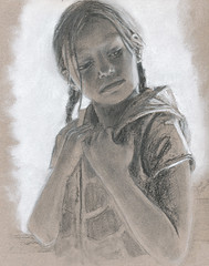
I find it only a little bit troubling that my best Halloween images to post are those from my Life Drawing class. Oh well....


This is a study of a head with the skin unfortunately peeled back to expose the skull in certain places.

Drawn in charcoal and graphite.

Tuesday, October 14, 2008

Life Drawing in Honor of Halloween

In honor of Halloween, I'm posting my homework from this week. It's the right hand as seen from a dog's point of view. The thumb is on the left; the large four bones are in the palm of the hand.

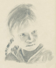
A while back I started taking a Figure Drawing class (aka Life Drawing) to help improve my drawing skills. It's so much fun! Mostly we use charcoal on large paper pads (18x24"), but also graphite, ink & brush, and other tools. It really loosens up the hand and arm to draw large.

Stabilo Carb-Othello pencils (brown, navy, white) on Strathmore Artists' Papers Charcoal Sheets (25" x 19") in Velvet Gray.

Thursday, September 25, 2008

Verus Farnsworth, entertainer & grandmother

This is a graphite drawing of Verus Farnsworth, my husband's grandmother, in a promotional photograph for an upcoming show. Her family were actors, musicians and entertainers, traveling from theatre or tent to the next nearly a century ago.


Verus Farnsworth

14" x 11" (cropped)

Graphite


Besides acting, Verus played the marimbas -- I've posted a photo below.


Isn't that a great pose?

Wednesday, September 10, 2008

Brian Williams and tonight's news

Watching the evening news tonight, I got the urge to sketch the host Brian Williams with my new conte pencils -- in three Old Masters colors, plus the tan color of the paper. Brian has such an interesting face, very fun to sketch. While he and some members of the press appear to be interpreting Obama's lipsticked-pig comment in line with their political affiliations (biz as usual), I don't care what Obama subjectively meant. I think he should have chosen a different metaphor so people wouldn't have to decide whether it was a reference to Sarah Palin because of her lipstick riddle or a reference to change, as he now says. Sarah Palin was an obvious and natural connection to make and importantly, a mean-spirited reference, and he should have seen that. He should have seen that.

Saturday, September 06, 2008

Glacier vacation

One of these days I may write a bit about our vacation to Glacier and Waterton National Parks in northern Montana and Alberta, Canada. At the moment I'm feeling overwhelmed by the number of photos I just uploaded to Flickr and tried to add descriptive captions to mountains and lakes whose names I have already forgotten.

The point is, the vacation photographs are up on Flickr for your perusal, or so you can say you did. Either way is fine. Once you're in Flickr.com (no "e"), my username is Flickring (no "e").
or
www.flickr.com/photos/-janet/, then go to the set called "Glacier National Park") .

Wednesday, July 16, 2008

Bogus Rough Sketch Paper and Blue Conte Crayons

12" x 9", Conte crayons on toned paper, in process
I've found two new art tools I wanted to share, both of which I used in this sketch:

First is the paper. It's a new pad of paper called Bogus Rough Sketch by Aquabee, a 70 weight (almost three times as thick as writing paper) medium brown, and it has a pretty rough texture so it can hold several layers of pastels, charcoal, conte crayons, etc. The brown color can serve as the midtone or skin color for portrait work, as I've done above. It's 100% recycled paper which is great; but it's not acid-free, so if you want it to last longer than you do, you'll need to spray it with that new-fangled magic acid-free-making spray stuff.

>>>>>>>>As an aside: the strangest thing happened when I added the pupils and iris colors -- the brown paper, which is part of the eye color, looked green! If you look closely at the eyes (enlarge it by clicking on the image), between the blue outer ring of the iris and the sepia inner ring around the pupil, you'll see a tiny bit of plain brown paper that will appear green. I love the strange tricks our brain does with color!

Anyway, the SECOND new item: I'm using blue instead of black in the above portrait which is drawn with Conte crayons, a centuries-old medium for drawing. But the traditional drawing colors are black, sepia, sanguine, and white -- rarely is blue substituted for black. The store had no black, so I got the blue. Since blue is the complimentary color of orange, which is a lot like the sepia and sanguine colors, it makes sense that they set each other off so well. I like the blue -- serendipity strikes again!

Saturday, July 12, 2008

Peacock Grouper stippled pen & ink

Peacock Grouper, 4x6", pen and ink

I stippled a bunch of fish eight years ago. That was the first time I tried to make art seriously as an adult. Dot by tiny freaking dot. I don't stipple anymore. I guess you could say I'm an ex-stippler.

I sure do appreciate a well-stippled fish, though.

(In the interest of total disclosure, the tan background of this image isn't stippled.)

Thursday, July 03, 2008


This is a sketch on 18" x 24" newsprint that I drew with charcoal in my new figure drawing course. I like to have an art class going at all times, and this summer I'm taking figure drawing, a full semester class crammed into 7 weeks.
We are learning "artistic anatomy" with a lecture one day, followed by three days of sketching from a live model. Last week we studied feet; this week it's hands. I am absolutely loving it!
I liked this model -- he's a guitar player, very slender, with long, curly black Italian hair. This pose was 10 minutes and we were to focus on hands and feet.

Monday, June 30, 2008

Paris metro art nouveau project: Glue Collograph


Starting in 1900 in Paris, entrances to subway stations were designed in art nouveau style by Hector Guimardas part of the Fulgence Bienvenüe project. Eighty-six of his entrances are still in existence and I think they're beautiful.

I made this collograph using matboard and glue, constructing all of the lines from glue, and after they dried, rolling and daubbing ink on the plate and printing it on an etching press.

I've posted process photos, showing the steps I took to make this, on my Flickr page.


Below are two photographs showing other subway entrances that were part of the project. For more information, see Wikipedia.


Photo attributions:
Left: Tom Fletcher
Right: Michael Reeve

Saturday, June 14, 2008

Drawing of 1937 Fishing Bridge beach at Yellowstone Park

For "Drawing Day 2008," I chose to draw from an old photograph taken in 1937. It shows three children sitting on the beach at Yellowstone Park's Fishing Bridge area, at the north end of Yellowstone Lake. This area is of the park is sentimental to me, partly because it has family history going back more than 70 years! The child on the far right is my father-in-law, once a Yellowstone Park ranger, and the other two are his sisters. His father, in turn, was a ranger naturalist for 15 summers, at this very spot, Fishing Bridge.

Drawing Day is an annual effort to post one million drawings on their web site, DrawingDay.org.

Tuesday, June 10, 2008

Mod - Digital Art

Fighting a cold, I took to the couch and laptop, and had 1950's fun with digital art. Usually I take photographs and artistically alter them in Photoshop Elements. But this one involved no photographs, just Photoshop. I just made shapes and filled them in, here and there, with subtle colors of pale yellow, gold and dark gray.

Mod, 6 x 8, digital image

Tuesday, June 03, 2008

Gale's Restaurant Art Benefit

Last night I had the privilege of being a featured artist at a benefit for the AIDS Service Center.


Gale's Restaurant in Pasadena held the event which was also sponsored by Walt Disney Engineering, Grey Goose, and other well-known eleomosynary organizations (great word, eleomosynary!!!). I had never been to Gale's but must say the food (Italian) was fantastic! The place was packed with people.
At one point, a volunteer docent handed me printed information on one of the artists: me! Maybe I should have worn a name tag...
I haven't heard about sales volumes yet, but I hope they did well. Many, many people gave their personal time, their energy, imagination, money, art, decorations, and more to make this benefit a success. And I had a great time! Here's a copy of one of the pieces of art I donated.


"Testing the Water," graphite, 8x6"

Thursday, May 22, 2008

Original Linocut of 400-year-old Dutch tile

I just matted and framed this 5x5" print of "Marigolds," a linocut printed on BFF Rives printmaking paper. Below I've described the process I used.


(Frame not shown) I've been eyeing this old 1620's Dutch Delft tile image for a long time and finally used it for a linocut carving, which I printed on an etching press and then painted with Winsor & Newton watercolors added watercolors in shades of blue, gold, and green.


Below is the printed image before I adding added any watercolor. I printed it in a very dark green color, which gives a good, strong contrast to the paper and the watercolors.

Below is the finished plate of linoleum which I carved to the pattern of the tile and inked in a dark color (with a brayer/roller) so you can see the raised portions that would eventually print. This type of linoleum is called Battleship Gray, and can be purchased at most art supply stores. I buy mine online at DickBlick or Daniel Smith.


This was one of the more fun linocuts I've done -- a good kitchen print, I think!

Tuesday, May 13, 2008

On Linocuts and Oil-Based Inks

May, 4" x 3", linocut
I used my little Blick tabletop etching press at home to print this linocut today. My access to the monster presses is limited to Fridays now, and I didn't need a giant press to print this little linocut. My press does a great job on small projects; I just don't like the clean-up fumes and mess I create at home after using an oil-based ink. And I haven't yet found a water-based ink that will stay moist while I'm printing even a small edition of prints, and give the coverage of an oil-based ink.

Sunday, May 11, 2008

Santa Paula window bars

I loved the 1950s look of the bars on these windows and thought they deserved a 1950s color palette, so I added one but could not stop playing with it. I made dozens of different color combinations. Here are a couple more:


Wednesday, March 26, 2008

If I Were Trying to Paint Like Klimt

If I tried to paint in the Gustav Klimt style, circa 1900, this is what my attempt would look like.


Thinking About Klimt, 6.5 x 4.5", watercolor, acrylic, and ink on Fabriano Medioevalis card.

Wednesday, March 12, 2008

Finishing Valentine's Day


In my last post, I said I was going to add patterns to the background to finish this piece. I finally did -- you can see them in the sky and in the foreground.
I framed it in a vintage 1930's mat and frame that I bought on ebay.
This kind of art - flat, bright, highly decorative --found just the right home on those old art deco and nouveau greeting cards.

Wednesday, February 13, 2008

Happy Valentines Day

After weeks studying and practicing the style of 1920's greeting card art (colorful, flowerly, idyllic scenery, and flat -- no dimension or shading), I've concocted and painted an entire scene from my own little brain.

Here is the first draft, without a background. I found I had limited my choices for a background color or pattern by drawing in the house and the line of the hill behind the couple. Ideas I had will no longer work for a background, unless I paint over the current one. Lesson learned! Plan first, paint second!


For the background, I wanted something different -- a geometric or graphic patterned background (something like the side panels), so the scene didn't look too realistic. I didn't want green grass and a blue sky. But guess what I did? Painted the grass green and the sky blue.

Well, that didn't look right at all. The green and blue were so mid-range that the man and woman disappeared. So I darkened the blue and green. Better, but now it looks like nighttime! Nighttime, with a parasol. Maybe she doesn't want to get a moon-burn.


But it's not too late, and I have a plan. I know some people won't like my plan, but I'm going back to the original geometric pattern idea. I'll post the final result later. First I need to find some ink or paint that will sit on top of the acrylic paint background.

Ta ta! (Or as Jody says, TTFN -- ta ta for now.)

Thursday, February 07, 2008

Vintage Valentine


Here's yet another pen and ink drawing (with watercolor) I did yesterday during a cherished "Art Day" with my two pals Belinda and Victor. I used a 1920's Valentine's Day card to make this drawing, with just a few little changes. My husband's uncle gave the card to his wife in 1922 and we are lucky enough to be the current guardians of this and other magnificent cards from that era.
I'm enjoying this kind of ink and watercolor style so much that I just might focus on it for a while. Focusing on just one form of art should result in less clutter, both in my head and in my surroundings.
Redhead with Bluebird
Pen and ink and watercolor
6" x 4"

Friday, January 04, 2008

When is a Doodle More than a Doodle and Isn't it a Great Word?


Have you heard of a Zentangle? Apparently it's a new aid to doodling, a how-to-doodle primer. They even sell kits for $49 to teach you how to doodle the Zentangle way -- apparently in repetitive patterns, section by section.

My doodle on the left isn't a Zentangle, though it may look like one. I'm not sure how I feel about the concept of doodle instruction. It conjures up paint-by-numbers kits and Bob Ross videos, only not as ... necessary. Aren't doodles supposed to be "mindless" and "aimless"?

But I think I'm being narrow-minded about it. If you google the word Zentangle, the first few hits are from quite zealous Zentanglers. Most feel great about drawing something so well-formed and want to share the art and the experience. One wrote, "I have been calling what I do 'doodles' and kind of felt guilty about not doing any 'real' art. Then HOLY COW - I realized I was Zentangling. . . . " Geez. That reminds me of my mandala drawings (I'll paste one here). Before I had ever heard of mandalas, I had drawn many dozens of them and honestly thought I had invented the art form. Ha! However, I didn't feel guilty about it as a time-waster. Doodling and drawing repetitive patterns is a well-established meditative, relaxing experience. So I say, "Go Zentanglers!"

Thursday, January 03, 2008

Pen and Ink

"Broken," pen & ink

Tuesday, January 01, 2008

Valentine's Day

How I've missed DRAWING! I've been so crafty lately instead. That's right -- caa-rafty.
I've been making cards and miniature books instead of drawing or painting. Fun, yes! But I need to fit in more drawing or I find I start craving it like a Cold Stone Creamery Chocolate with Almonds and Cookie Dough.
Currently I'm feeling inspired by* some Valentine's Day cards from the 1910's through 1930's, some very art deco, some art nouveau. I'm loving the art and must draw from them.
*"Inspired by" can mean "copied from," but I'm not that good. I take a lot of liberties.*
*"Liberties" can mean you purposely deviated from the original, but in my case, I take liberties when I make mistakes and have to go another direction to cover them up.
Here's another, to which I've added my initials. I want to start practicing calligraphy -- right after the letterpress class which starts very soon. My hope is that the letterpress art will synthesize with the printmaking and bookmaking and cards into ... something fabulous.


Thursday, December 13, 2007

Collage Education

I'm working on my collage education. Not college. Collage.

Here are a couple of my recent collage efforts.

"Beach Joan Crawford," collage
8" x 11"


Vegetarian, linocut print and mixed media collage,
6-1/8" x 6-1/8";

both for sale here

on PlanetJanet's Etsy store (all handmade art and goods), and all profits go to the Alzheimer's Association.


Next I'll be collaging with my vintage postcard collection.

Wednesday, December 05, 2007

Etsy, Charity, and a Good Decision

I make a lot of art (I see some of you smiling in that knowing way). The house and the husband are showing signs of being overwhelmed. You who know me are aware of my months-long struggle with how to continue to make art without have it taking up space. I have found this to be against the natural laws of physics. So I've decided to start selling online and to donate 100% of the profits to the Alzheimer's Association. This will permit me to continue to produce artwork, to sell without the self-conscious feeling of self-promotion, and to help (little by little) with research and treatment of Alzheimer's Disease.

As if I was receiving approval from God above, within 24 hours of posting my first item for sale, I received an email from a writer who mentioned me in an article she wrote (here's an edited version):

Holiday Gifts that Benefit Charity
by Phyllis Mufson
"'Gifts That Give Twice,' is the title of an article I wrote on November 20th about holiday gifts from Etsy.com sellers that benefit charity. The article struck a chord. It received (and continues to receive) tremendous interest from people looking to give more meaningful gifts.
. . .
"This mini-map-book (2" X 2") from Janet Catmull of Planet Janet http://planetjanet.etsy.com is covered with a map of France and a stamp of India, and has accordion pages, each with a map on a cancelled stamp from Australia, Angola, Ceskoslovensko (former Czechoslovakia), Polska (Poland), India, France, and Abkhazia. 100% of the price ($8) of the mini-book and of all items in the store will be donated to Alzheimer's Association National Office http://www.alz.org."


I have two relatives afflicted with Alzheimer's Disease, my uncle just passed away from it, and it seems like everyone I talk to knows someone who is dealing with it. I'm going to do my best to help. In the past 48 hours I've posted a dozen or so items on my Etsy store.

About Etsy: My store is not the only one on Etsy.com that sells for charity. And if you're not familiar with Etsy, it's an online website for sellers of all handmade items. I'm impressed with the quality of most items and the prices are low, low, low! Most items are as nice as anything at Macy's or anywhere else. And the packaging is usually over-the-top -- ribbon-tied boxes, immediate shipment, extras in the packaging. Yesterday I received a leather journal I ordered for $12, and it's gorgeous. It arrived with a free leather bookmark, a little cut-out leather heart on a string, and in beautiful packaging. Etsy sellers usually take extra care to make their products special.

(The name Etsy derives from the Latin "And If..." (et si). The founder was thinking, "And if we do this, and if we do that...". Anyway. )

Thursday, November 08, 2007

Bookplates - Ex Libris - From the Library of


Bookplates have been used to identify the owner of books since the medieval times. Actually, I just made that up. But according to Wikipedia, they were used as early as the 14th century.

Three of the five I've posted today are made with linocuts -- carved linoleum -- and the other two are pen and ink drawings. I used a magnifying glass for all of them. The red-orange tulip has the owner's initials "JC" and the rest are ready for them.

I recently bought a 1920's book on the subject entitled, "Nothing, or the Bookplate," by Edward Gordon Craig, in which he actually "tips in" or glues 25 original bookplates into the book! They're spectacular.

Anyway, the point is that he believes the size of a bookplate should rarely exceed 1-1/2" square. That's barely postage stamp size! Being a fan of miniatures, I'm going with his recommendation.


Butterfly
, Ladybug, and Tulip are linocut prints; and Letter P and Letter B are pen and ink drawings.


Handmade Miniature Books


Handmade blank book, 2" H x 1-5/8" W
5/16" thick block of white paper pages

I am smitten by miniatures, paper, printmaking, pen & ink, bookplates, and books. Add them up and what do you get? Handmade miniature books. I've made two in the past week or so and both are posted here. The book above is tiny -- only two inches tall, about the size of the smallest Post-It Note pad. The one below is slightly larger -- three inches tall. To qualify as a true "miniature" book in the U.S., no side can be larger than three inches (some organizations permit sizes up to four inches).


Handmade Blank Book, 3" H x 2-5/8" W
Inside: Six hand-sewn signatures (sections) of 50 lb. recycled white paper;
Each signature includes a patterned sheet of paper that is
color-coordinated with the cover paper; bookmark ribbon

Next up: Miniature bookplates....