Thursday, December 13, 2007

Collage Education

I'm working on my collage education. Not college. Collage.

Here are a couple of my recent collage efforts.

"Beach Joan Crawford," collage
8" x 11"


Vegetarian, linocut print and mixed media collage,
6-1/8" x 6-1/8";

both for sale here

on PlanetJanet's Etsy store (all handmade art and goods), and all profits go to the Alzheimer's Association.


Next I'll be collaging with my vintage postcard collection.

Wednesday, December 05, 2007

Etsy, Charity, and a Good Decision

I make a lot of art (I see some of you smiling in that knowing way). The house and the husband are showing signs of being overwhelmed. You who know me are aware of my months-long struggle with how to continue to make art without have it taking up space. I have found this to be against the natural laws of physics. So I've decided to start selling online and to donate 100% of the profits to the Alzheimer's Association. This will permit me to continue to produce artwork, to sell without the self-conscious feeling of self-promotion, and to help (little by little) with research and treatment of Alzheimer's Disease.

As if I was receiving approval from God above, within 24 hours of posting my first item for sale, I received an email from a writer who mentioned me in an article she wrote (here's an edited version):

Holiday Gifts that Benefit Charity
by Phyllis Mufson
"'Gifts That Give Twice,' is the title of an article I wrote on November 20th about holiday gifts from Etsy.com sellers that benefit charity. The article struck a chord. It received (and continues to receive) tremendous interest from people looking to give more meaningful gifts.
. . .
"This mini-map-book (2" X 2") from Janet Catmull of Planet Janet http://planetjanet.etsy.com is covered with a map of France and a stamp of India, and has accordion pages, each with a map on a cancelled stamp from Australia, Angola, Ceskoslovensko (former Czechoslovakia), Polska (Poland), India, France, and Abkhazia. 100% of the price ($8) of the mini-book and of all items in the store will be donated to Alzheimer's Association National Office http://www.alz.org."


I have two relatives afflicted with Alzheimer's Disease, my uncle just passed away from it, and it seems like everyone I talk to knows someone who is dealing with it. I'm going to do my best to help. In the past 48 hours I've posted a dozen or so items on my Etsy store.

About Etsy: My store is not the only one on Etsy.com that sells for charity. And if you're not familiar with Etsy, it's an online website for sellers of all handmade items. I'm impressed with the quality of most items and the prices are low, low, low! Most items are as nice as anything at Macy's or anywhere else. And the packaging is usually over-the-top -- ribbon-tied boxes, immediate shipment, extras in the packaging. Yesterday I received a leather journal I ordered for $12, and it's gorgeous. It arrived with a free leather bookmark, a little cut-out leather heart on a string, and in beautiful packaging. Etsy sellers usually take extra care to make their products special.

(The name Etsy derives from the Latin "And If..." (et si). The founder was thinking, "And if we do this, and if we do that...". Anyway. )

Thursday, November 08, 2007

Bookplates - Ex Libris - From the Library of


Bookplates have been used to identify the owner of books since the medieval times. Actually, I just made that up. But according to Wikipedia, they were used as early as the 14th century.

Three of the five I've posted today are made with linocuts -- carved linoleum -- and the other two are pen and ink drawings. I used a magnifying glass for all of them. The red-orange tulip has the owner's initials "JC" and the rest are ready for them.

I recently bought a 1920's book on the subject entitled, "Nothing, or the Bookplate," by Edward Gordon Craig, in which he actually "tips in" or glues 25 original bookplates into the book! They're spectacular.

Anyway, the point is that he believes the size of a bookplate should rarely exceed 1-1/2" square. That's barely postage stamp size! Being a fan of miniatures, I'm going with his recommendation.


Butterfly
, Ladybug, and Tulip are linocut prints; and Letter P and Letter B are pen and ink drawings.


Handmade Miniature Books


Handmade blank book, 2" H x 1-5/8" W
5/16" thick block of white paper pages

I am smitten by miniatures, paper, printmaking, pen & ink, bookplates, and books. Add them up and what do you get? Handmade miniature books. I've made two in the past week or so and both are posted here. The book above is tiny -- only two inches tall, about the size of the smallest Post-It Note pad. The one below is slightly larger -- three inches tall. To qualify as a true "miniature" book in the U.S., no side can be larger than three inches (some organizations permit sizes up to four inches).


Handmade Blank Book, 3" H x 2-5/8" W
Inside: Six hand-sewn signatures (sections) of 50 lb. recycled white paper;
Each signature includes a patterned sheet of paper that is
color-coordinated with the cover paper; bookmark ribbon

Next up: Miniature bookplates....

Monday, October 15, 2007

On Choosing Titles for Art

I have not given this acrylic painting a name. That fact made me realize choosing titles for my artwork is not one of my strong suits. I tend to be obvious: "Crow," "Peacock," "Girl with Braids." Thank goodness the girl wore braids...

My artist-friends are so clever. Look at Nancy's titles: "Hot and Humid," "Converging Thoughts," and "Secret Places." Geez! I wish I could think of original, interesting titles. Perhaps a thesaurus would be helpful.

About the art. I've wanted to paint on a gesso panel for a long time, and I really enjoyed the process! No bumpy canvas to deal with. The paint glided on like butter. Layers resisted new layers if I wanted them to. They obeyed. It was magical, so different from printmaking, where you can't completely control your end product and each print pulled from the same plate has its own personality.

But I'm feeling nervous again, too many interests, not enough time. Besides working on gessoed panels, I've been craving my pastels lately. And today I'm starting a new project with linocuts. Looks like it's time to prioritize.


Saturday, October 06, 2007

Don't have a cow! Have two.

This is a very small (5" x 5") acrylic painting. I love backlighting and have tons of photographs of backlit scenes.

I finally uploaded some items to my Etsy store today, just a few sets of note cards and this painting. I know I should be more diligent about keeping the "store" stocked.
Shoulda woulda coulda, right?

Sunburst Pasture, acrylic on canvas, 5"x5", for sale here.

Thursday, October 04, 2007

Channeling Mary Cassat?

Nearly Bedtime, 6"x4", drypoint engraving on paper

Mary Cassat was an American artist who lived in Paris in the late 19th century. She was a member of the Impressionists, a small group of now-famous artists who started a unique painting style in the late 1800's. Mary Cassat favored images of women in her art, often mothers with children. As I was engraving the drypoint plate for this print, my artist-friend BDP sneaked a peek and commented on the Cassat-like subject matter. Cassat was a huge influence on me when I first began painting with pastels. And Cassat was influenced by Japanese printmakers. Now I appreciate and understand that influence more than ever. It seems a natural progression from pastel painting to printmaking.

The people in the image are my sister-in-law and her first child, from a photograph I took only a couple of years ago.

This kind of drypoint was made from using a sharp pencil-shaped tool to scratch the image into a Lexan plate, then wiping the plate with ink and printing it onto damp paper. The damp paper loosens the paper's fibers and allows the paper to pick up the ink from the crevices in the plate as it goes through the etching press.

Thursday, September 27, 2007

Learning to Mat and Frame

"Nest", monotype chine-colle on buff-colored paper, 12"x 12" framed

After four semesters of printmaking classes, three classes a week, I have a stack of art prints that's getting ridiculously large. It gives me a vague feeling of waste as they accumulate, ignored. So a while back I decided to actively attack the problem. I have given many away to family and friends, but trying to sell them concerns me because I don't want to lose any of the joy I feel doing it simply for the love of it, as a hobby.
Recently, though, an artist-friend invited me to join her and other artists exhibiting art at a charity auction/gala tomorrow night, selling our art for the cause. I think it's a good way to begin minimizing the stack of art. So I had to learn how to mat and frame, and make various other paper items describing the art. I thought getting ready for this event would be a simple matter, but let me tell you, it was harrrd! I had to rely heavily on my friends for their help and advice.
My brain is fatigued, but not as fatigued as my feet will be at the end of six hours tomorrow night. Yet I really do believe it will be a great experience for me personally, and I hope we'll all raise some funds for the charity.
Arf Arf! I framed old "Rascal" to match the "Nest".


Saturday, September 15, 2007

Biltmore Tower blockprint

This is an artist's proof of a woodcut I just finished carving. I used ultramarine blue ink on cream Arches printmaking paper. That blue is a new shade -- pretty bold.

It's an image of the Biltmore Tower, in which I worked for a couple of years. It's attached to the Biltmore Hotel in downtown Los Angeles. I took some liberties with this image, but the tower should be recognizable to you who are familiar with it.

Ahhh, the good old days! :-)


Biltmore Tower, linocut, 12" x 10"

Sunday, September 09, 2007

Today: Being Female

Today it's all about being female. This lavendar image is made from a woodcut I carved out and printed on teal-colored Japanese paper that was very fibrous. The teal paper with the lavendar image was adhered to heavy, white printmaking paper and run through an etching press. The process is called a woodcut chine-colle print.


I wasn't trying to carve the shape of a woman. I just started carving in a swirling and curvy way, and before I knew it, there was the image of a woman. Except for the very top, but then I realized perhaps she has raised her arms. I have made several prints of this in different color combinations, as well as black on white paper.

Abstract Woman, 12x6", woodcut chine-colle


Below is a pen and ink drawing the way I personally like to do them -- like doodling but with thought as to the design. This one has a couple doves hiding among the leaves, flowers and other shapes. Click on the image if you'd like to see it better.


Doves and Leaves, c. 5x5", pen & ink on paper

Tuesday, August 28, 2007

Hibiscus and other bright flowers

Hibiscus blusher, digital photograph 8/27/07 (all rights reserved - I know you want it!)

Have you noticed what's back in style? 1950's-1970's surfing, tiki, and Hawaiian/tiki themes. That means hibiscus floral prints (I put a white hibiscus decal on my car's rear window), surfboard and beach icons, and maybe even tiki paraphernalia. My favorite related color scheme would be aqua blue, leaf green, and buttery yellow or tan -- beach colors. I did my part to stay hip by buying a hibiscus bush (photo above).

I know the one-image-per-day blog rule, but I couldn't wait to post an image I created from cast shadows (below)! I noticed some attractively-shaped shadows on our sidewalk and wanted to use them in art. So I photographed the shadows, uploaded them to Photoshop and applied a couple filters to get the image below.


Lights From the Shadows, Digitally Altered Photograph


Wednesday, August 22, 2007

Oil rigs -- doesn't everybody LOVE them?

S. Belridge Oil Rigs, gouache on paper, 6x9"


My husband and I were driving north on Interstate 5 to Cambria, and took a highway that cut west to the central coast. Soon we stumbled upon the largest oil fields I've ever seen in my life, and there are lots in Southern California. Oil rigs pumping as far as I could see. There were hundreds if not thousands of rigs, many in bright colors, and at all angles. I loved the almost architectural imagery. I quickly snapped two bad photos and vowed to take more on the way home, but we took a different route back. Recently I painted the scene with gouache paints (above), but I forgot to use my artistic license -- my two photos didn't capture many rigs and I forgot to slip more in, so the whole point is kind of missed. At least I'm a honest painter, eh?

Tuesday, August 21, 2007

Koi Trio

I'm practicing my painting again. I haven't actually painted, used a brush, in a while. When my mojo strikes, I tend to reach for pens or do some form of printmaking. Painting is hard! I need to produce a few items for an event at the end of September, so I must get going. This is an acrylic painting of some koi in a pond in Ragged Point, California (north of San Simeon on the Central Coast). It's 6x9" and is untitled.


Monday, July 02, 2007

For my Etsy friends: a photo of my art supplies

Today I made a promise on my Etsy bio that I would show them my coffee table covered with art & craft supplies. I said this is why I'm selling things on Etsy. (In case you missed my last post, Etsy is a website where you can sell handmade items for cheap.) So here goes. Here's today's coffee table mess. Please don't judge me; I'm not proud. Well maybe just a little. heehee!

Here's a related quiz (the answers are at the end):

1. What's the most important item on the table? (click on the image to enlarge it)

2. What do the two red X's mean?

3. What would my mother say if she saw this photo?


Answers:


1. My coffee (look for the red heart encircling it).


2. Available space on the table that I didn't notice last night.


3. She'd smile, she'd say, "My land," and she'd shake her head just a teeny bit. Right, Mom? (She's reading this.) Now if I was still living at home, I'd be in big trouble but that makes sense when you're sharing space with seven other people. Now I know why the dog wasn't allowed in the house -- Mom and Dad were looking out for my art supplies.

Wednesday, June 27, 2007

Oh boy, I'm on Etsy!


Due to popular demand (of my husband demanding I get rid of some of this clutter) I'm selling some of my handmade things on Etsy, an internet store. I need to do something with all this stuff I'm making, and my relatives must be getting sick of all the handouts. (Hey, wanna come over for a barbecue? Hey, while you're here, can I show you some stuff I've made? Hey, any chance you'd like some of these? Great - take as many as you want!) The stash is thereby minimized and I get to make more, giving me the only legitimate reason to continue the hobby.


But how many handmade cards can my sisters-in-law need? And my mother long ago started politely declining my offers ("I just don't need any more cards, dear, I have plenty, really") -- it must be Depression-era thinking, you know, as I'm not familiar with the concept of having "plenty" of anything.


So in steps Etsy.com to the rescue, to perpetuate my hobby, my #1 entertainment, my joie de vivre. Etsy isn't an auction site like eBay, and everything has to be handmade. You just open a store (i.e., give them a credit card number) and pick a user name) post an item and hope someone buys it (or sees it, actually - the hard part is that you're one anchovy in an ocean full of anchovies, trout, and whales).


So check out Etsy if you're so inclined. My store name is "PlanetJanet" (cute, huh?), and the URL is PlanetJanet.etsy.com, or click on one of the blue links I just gave you, but remember the name because it's not user-friendly in that way. And if you're a relative or friend or just want to be, come by the house, sort through the stash, and avoid shipping fees!

Friday, June 15, 2007

Mystery Woman - in pastel...

Lonnie, in pastel on paper, 11x14"
I painted this image without knowing the person -- she just came out of my head, so to speak. I wonder if someone out there looks like her. I decided to call her Lonnie because that's the name that popped into my head when I wondered what to name it. Wouldn't it be stange if there was a woman out there who looked like this named Lonnie?

Saturday, June 02, 2007

Rascal

Rascal, drypoint, 4 x 4.5"

Printmaking class ended last week with a print exchange among 24 students. I tried to make a Klimt-like collograph consisting of a lovely lady with a dress of flowers and geometric patterns, and a geometric-patterned background. So cool! But it wouldn't print because -- and this is embarrassing -- I used my acrylic matte gesso instead of acrylic matte medium. I brushed on layer upon layer of chalky gesso instead of the clear, slick medium, and the ink stuck to every particle of gesso, giving me a ridiculously dusty, sloppy print with no detail at all. So...I sadly and pathetically opted out of the print exchange.

But I am stubborn. I had 3 hours before class time and nothing to exchange. I know I can rip out a drypoint in an hour or two, so starting at 8 am I etched this doggie into a plexi plate and started printing it in an hour. As I printed them, I laid them outside to dry. By 11 am I had the required 24 prints and ran off to class. The true miracle was that this Santa Clarita Valley air actually dried the prints during those 3 hours! It really was a miracle.

My friends in class said I work best under pressure. I don't know about "best," but I do dawdle like a child if I have plenty of time to get a thing done. Remember the original Frankenstein movie, and the ill-fated little girl by the well that's playing with a flower and singing? That's me when I'm should be working.

By the way, Rascal was our family dog from about 1965 to 1979.

Thursday, May 24, 2007

Peacock


Peacock, 6x9"

Sometimes I am apologetic when I use bright colors. This paranoia comes from reading one art magazine article a few months ago which said muted colors are mature and bright colors are ... not. I've decided to stop apologizing and use whatever colors I like. :-D

I started this peacock drawing with a loose pen sketch, which I colored with Prismacolor pencils. Then I scanned it and applied a filter called "accented edges" in Photoshop. Wanting to show the detail and texture of the feathers, I decided to crop out about half the image and enlarge it. That worked. I lost a lot of the tail, but at least you can see the details clearly.

Tuesday, May 22, 2007

Cypress Road and a lesson on pastel primer

Cypress Road, 2-1/2" x 3-1/2"
After several days on the couch recovering from yucky jaw surgery, I had a strong craving to paint something with colors, anything, but I had to be able to do it on the couch in the living room. So I got out the soft pastel pencils. Regular pastels (chalks) are so dusty and messy I can't use them in the living room. Pastel pencils had to suffice.

I did use workable fixative as I went along to add more texture to the surface, plus I started out by coating the illustration board with a thin layer of fine tooth Colourfix pastel primer (for the first time ever), which really did give it lots of tooth. In fact, it almost felt like Wallis sanded paper (sorry Mister Wallis, if you're out there, and your shareholders, but I'm on to something here).

Saturday, May 19, 2007

Mandala

It's so much fun to draw a mandala! I know you're supposed to meditate on finished ones, but my meditative process occurs while drawing them. If you'll click on the image you can see the detail, which is the whole idea of the mandalas I draw -- lots of small detail. Sometimes they look like an ant farm on a busy day.

Sunday, May 13, 2007

Two "Golden Stairs" ladies

I discovered the artist Edward Burne-Jones on my first trip to the Getty a few years ago. Afterwards, at the Getty gift shop, I even bought the poster of his painting, "The Golden Stairs," showing eighteen golden-pearly-gowned ladies (angels?) descending a long staircase, each carrying a musical instrument. I think it's a sort of spiritual-religious painting, but without any icons to know for sure. This drawing shows two of the women who were near the top of the staircase, without their instruments, which I sketched with pastels.

Thursday, April 26, 2007

Illustration Friday - "Polar"


For Illustration Friday's theme "Polar," I chose to draw the South Pole sinking of the "Endurance" which did not, in fact, endure the polar ice in its 1915 Antarctic expedition. The dogs made it out, though.


Pen & ink, with gray gouache, 5x8"


Sunday, April 22, 2007

Benedicamina Illumination


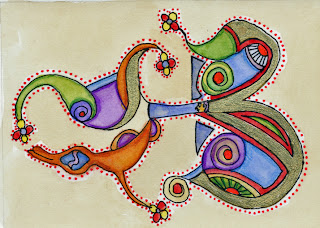
Say what? "Benedicamina Illumination" is the title of this pen and ink (and gold leaf) painting/drawing. "Benedicamina" because that's written on the scroll held by the angel at the top, which is loosely translated from Psalms 103 as Bless God Always. I had to find verse that might have been used in ancient times and would fit in that little space. "Illumination" because I drew it in the form of an ancient illuminated manuscript.

I LOVE illustrated manuscript art, the more complex and colorful and full of line-work, the better. A Book of Hours is a treasure I could spend days or weeks studying, but I doubt I'll never be allowed to peruse an authentic one, though occasionally someone will sell a single page on eBay. I've also seen them exhibited at the Getty Art Center here in Los Angeles. Then there's the Book of Kells ornately decorated by monks in Dublin, Ireland, famous for its extraordinary beauty and detail.

For two or three years, I've wanted to try making one myself. I didn't feel capable of actually writing a page from a manuscript and illuminating (decorating) it, so I just went with the decoration part, and just wrote a one-liner from Psalms 103. It took six full days! I tried to be authentic as far as using colors that existed at the time and gold leaf, but I couldn't see using real vellum (from calf skin) for so many reasons.

Ponte Vecchio, Firenze: Drypoint


Thank you BDP (yeah, you eBay printmakers know her if you think about it!) for letting me use your photograph of Florence, Italy's Ponte Vecchio for this drypoint, which I watercolored (ironically). What is a drypoint? Why am I asking you? ha ha I beveled the edges of a 6" x 8" sheet of Lexan and etched or scratched, really, the lines of this image into it with pointed tools. Then I inked the plate (yuck, a laborious and dirty process) and printed it using an etching press. I liked the print at that stage (all lines), but it looks better with watercolor.

But alas, this plate is losing its burrs and I can't get much more out of it. While Lexan and acrylics are easier to etch than traditional copper and zinc, they don't hold their burrs as well under the pressure of the etching press. The burrs are the line edges that actually print; when they're gone, the lines may print but the character of the print is gone.

P.S. OK you world travelers, what's wrong with this image? Yeah, yeah, yeah, I know, you smartypantses. If you know the answer, go ahead, make your comment below. A gold star for everyone that gets it right. But don't play if you can't be nice. I'm sensitive.

Tuesday, April 10, 2007

Pieces of Prints in April

I've got pieces of April
I keep them in a memory bouquet

- Best of Three Dog Night

I've got pieces of prints in a memory collage. Recently I decided to make handmade paper to print on. My printmaking professor (I'm calling him "Professor" in exchange for a good grade) had saved up lots of prints gone bad, which he had torn into tiny pieces, ready for papermaking. He let me take what I needed for my project. Some of the little printed pieces looked like little prints in themselves. So I culled some out and made this collage from them. I'm taking it to class tomorow to see if anyone recognizes any of the pieces.


And above is a woodcut I printed on beautiful Italian paper. There's so much groovy paper out there; it's hard to simply make a plain old black and white print.
Coming up next: a groovy black and white print or two.

Wednesday, March 28, 2007

Crazy Egon


I guess artist Egon Schiele was a crazy guy and a lot of his nudes are too, ummm, confrontational for me (Mom, don't look him up on the Net!). But some of his drawings were brilliant and even emotionally moving, appearing to show bruises or blood vessels, visceral skin marks that shout vulnerability and pain. This woodcut print was inspired by his drawing "Reclining Woman With Green Stockings" from 1917, the year before he died at age 28, three days after his wife died, both from Spanish flu.

Saturday, March 24, 2007

Paper with Newspaper Clippings


I bought the most interesting handmade paper from Phoenix Art Supply (.com)* in vivid red with small pieces of printed text in it! I used it for the linocut above --you can see one of the clippings near her right temple. By operator error, the rest of the clippings were covered up by the black ink. Oops. Anyway, when a piece of paper is used on top of the support page, it's called Chine-Colle, pronounced shin collay, meaning paper and glue, basically.


Above is another linocut using Phoenix's handmade paper with a blue and aqua pattern. Again, I'm not showing the paper off well, but it really is pretty. I'm actually listing a print from the Weathervane series for sale, believe it or not, on ebay for charity - the Arthritis National Research Foundation.

*I have no connection to Phoenix Art Supply (http://www.phoenixartsupply.com) except I have bought lots of lovely (and crazy) handmade paper from them online. They have unusually helpful and friendly customer service by Judy L., who even sent me a Thank You note after my first purchase. And I didn't spend that much; she's just sincere about her job.

Thursday, March 22, 2007

Crows everywhere (except here)


I've noticed a proliferation of crows both at home (geez, they are EVERYWHERE!) and as art on eBay and other sites. They're great looking birds. I've even just made a monoprint of a crow, so I'm joining the ranks. But today, no crows. Just three simple little birds from my imagination.


First is a pen and ink drawing; second a collograph (cut paper and matboard, printed), and last a drypoint engraving on acrylic.


Monday, March 19, 2007

Weathervane Linocut

This linocut print surprised me because of all the texture that resulted from setting the press a little too tight. The damp printmaking paper tucked itself far into all of the grooves of the linoleum block, picking up more ink than I expected and thoroughly embossing the softened printmaking paper.

So at first I thought Id have to carve away more of the background, go easier on the press settings, and try again. But I've decided that all the extra lines and embossing as well as the unexpected fire-like image of the leaves make the image more alive and exciting to me, so I think I'll leave it be.

Collage for Nicole

This is a collage on a postcard for my friend Nicole. I tried to use images that relate to her. I've included images of a koi, the beach, boats, sailing, girls, a bird, dog, visit to Texas, cows and the word "breathtaking". As I look at the collage, I must say how much it does remind me of her. Except perhaps for the orange koi fish (that's rising head-first out of the island in the background): that doesn't really relate to her in any way I can think of. Wait ....No.


Also the dog and bird in the foreground -- she's never had a dog or pet bird. A guinea pig, a little blue fish, but no dog or bird. I thought they were cute. I couldn't find a picture of an iguana.

Neither of the girls in the collage remind me of her, actually. As for the beach/boat/sail image theme, she does live near a beach, and while she neither goes there nor sails, I happen to know that she knows someone who sells boats. So the collage works well with regard to the pet/girl/beach/boat aspects. Or the beach/boat aspects.

Nicole is definitely "breathtaking". End of story. The first (and only) time she was in Texas was to visit me! She was gestating in the womb at the time, but that's no reason not to count it. While in Texas, we saw lots of cows, just like the ones in the collage. That's a gimme.


So all in all, I think it truly captures the essens d' Nicole, and it's probably the finest collage I've ever made, to boot. In fact, I'm quite sure I never finished the other one.

Nicole, I love you, girl!!! I'm putting the card in today's mail.

Thursday, March 15, 2007

All About Flowers Today


I want to say thank you to those of you who have sent such encouraging comments via my blog and personal emails. Blogging isn't as good as face-to-face relations, but in our fast-paced society, it's starting to feel personal.

I've been -- well, all over the place lately. In my blockprinting class, I'm focused on chine-colle prints, like the previous post. But at home it's a different story. Today I'm posting a couple flowers I photographed then passed through a filter in Photoshop Elements. They aren't altered much, really, just enough to make them more artsy.


About the first image, the pink rose: We grow these curly, almost neon-pink-and-orange rose bushes in our back yard which no one can see but us, and I'd bet Joe's not looking much, so that leaves me and the cat. But I really do like them. The black dots came from the filter. The image below it is a Japanese Plum tree twig from the tree in our yard.

This is one of those California ice plant flowers that open at sunrise and close at sunset. This one was just about to open up. I say "California ice plant" because my husband never heard of ice plants until he moved to California. It grows all over the neighborhoods where I grew up, near the south bay beaches, especially around the Playa del Rey dunes. I vividly remember seeing ice plant on my walks to school and the beach as a kid, and outside my old Playa del Rey condo.